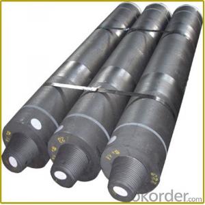
Ah, the world of graphite electrode prices. It’s a topic that can be as thrilling as a rollercoaster ride or as mundane as watching paint dry, depending on who you ask. But fear not, dear reader, for I am here to guide you through the twists and turns of this fascinating subject. Strap in and let’s dive into the depths of graphite electrode price charts, and understand the data that shapes this industry.
First things first, what exactly are graphite electrodes? Picture a long, slender rod made of pure graphite, used in all sorts of industrial processes. They’re essential in the production of steel, where they play a crucial role in the electric arc furnace. But I digress. The real meat of our discussion lies in the price charts, those cryptic yet oh-so-important visual representations of the market’s heartbeat.
Now, when you’re staring at a graphite electrode price chart, you might feel like you need a decoder ring to make sense of it all. But don’t worry, I’m here to help you crack the code. These charts are essentially a visual representation of supply and demand, reflecting the ebb and flow of the market. As the demand for graphite electrodes rises, so do the prices. Conversely, when demand wanes, prices tend to drop. It’s the law of the jungle, or in this case, the law of the market.
Let’s talk about the different types of price charts you might come across. There’s the line chart, which is like a connect-the-dots for adults, showing the price trend over time. Then there’s the bar chart, which is like a series of vertical bars, each representing a specific time period and its corresponding price. And who could forget the candlestick chart, a favorite among traders, with its colorful boxes representing the opening, closing, high, and low prices for a given period.
But what makes these charts truly come alive is the data behind them. This data is gathered from various sources, including production reports, import and export statistics, and even geopolitical events that might affect the market. For example, a natural disaster in a major graphite-producing region could send prices skyrocketing, while a breakthrough in electrode technology might lead to a price drop as supply increases.
Now, you might be wondering, ‘Why should I care about all this?’ Well, if you’re in the steel industry, or if you’re an investor looking to make a buck, keeping an eye on graphite electrode prices is crucial. These prices can impact your bottom line and your investment decisions. And let’s not forget the environmental angle – as the world moves towards more sustainable practices, the demand for graphite electrodes might shift as new technologies emerge.
So, how do you read these charts effectively? It starts with understanding the basics of supply and demand, and then moving on to more advanced concepts like trends, patterns, and seasonal fluctuations. You’ll also want to keep an eye on relevant news and events that could influence the market. And, of course, practice makes perfect. The more you immerse yourself in the world of graphite electrode prices, the more intuitive it will become.
But remember, no chart can predict the future with 100% accuracy. There will always be surprises and unexpected twists in the road. That’s the beauty of the market – it’s a living, breathing entity that’s constantly evolving. So, while you can use these charts as a guide, always be prepared for the unexpected.
In conclusion, graphite electrode price charts are more than just a bunch of lines and bars on a page. They’re a window into the dynamic world of the graphite electrode market, reflecting the intricate dance of supply and demand. By understanding the data behind these charts, you can make more informed decisions and navigate the market with confidence. So, the next time you find yourself staring at a price chart, don’t let the complexity overwhelm you. Instead, embrace the challenge and let it be your guide in the ever-changing landscape of the graphite electrode industry.

